Abstract Design:
Color/Design/Pattern
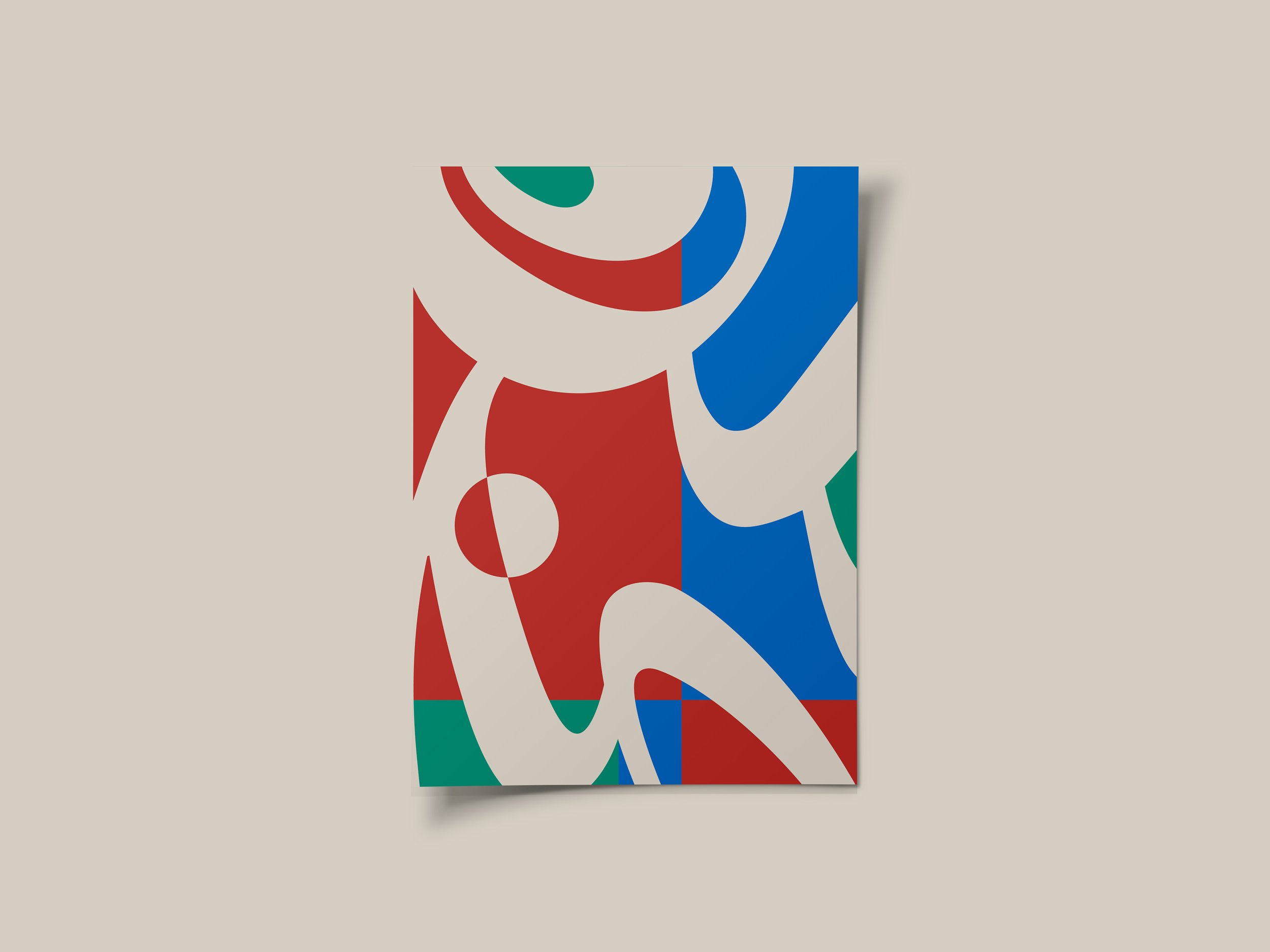
This project was created by taking inspiration from the iconic Bauhaus school style.
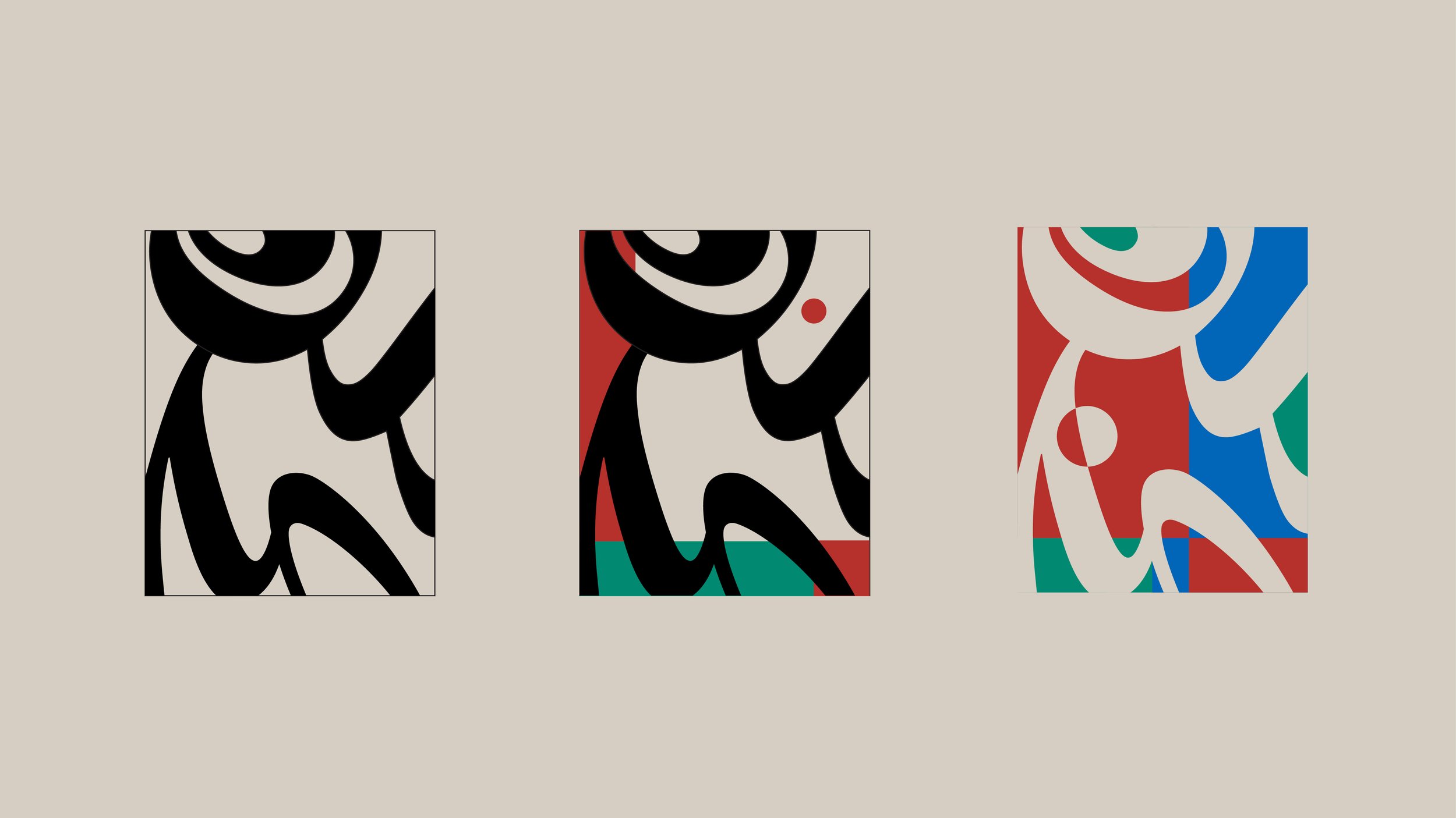
The focal design was taken from a previous project I worked on at Laguna College of Art and Design. The shapes are composed solely by solid black letters of the alphabet, with no distortion, just scale varieties. The composition of negative and positive space that is created by the letters, has a playful, almost human like nature.
After refining the preliminary design, the next step was to begin using geometric shapes to tie in a Bauhaus-like aesthetic. I explored many options with different shape placements and colors.
In the final edit I chose to change the focal design to a light beige color, which not only complemented the vibrant colors of the background, but created a more pleasing and unified composition.
The steps of progress can be seen below.

